The Bïrch (formerly Revealbot) website got a new look. In this article, we’re taking a dive into the reasoning behind the restyling, the elements of the new visuals, and what to expect next.
For us at Bïrch, design has always been a crucial element of our product. We aimed to create a friendly and accommodating look. But as the company and Bïrch community grew, our priorities and vision began to evolve. It was time to make some changes.
Why did we decide to restyle?
We really like the old Bïrch look. In fact, we will be remembering it with a lot of nostalgia.
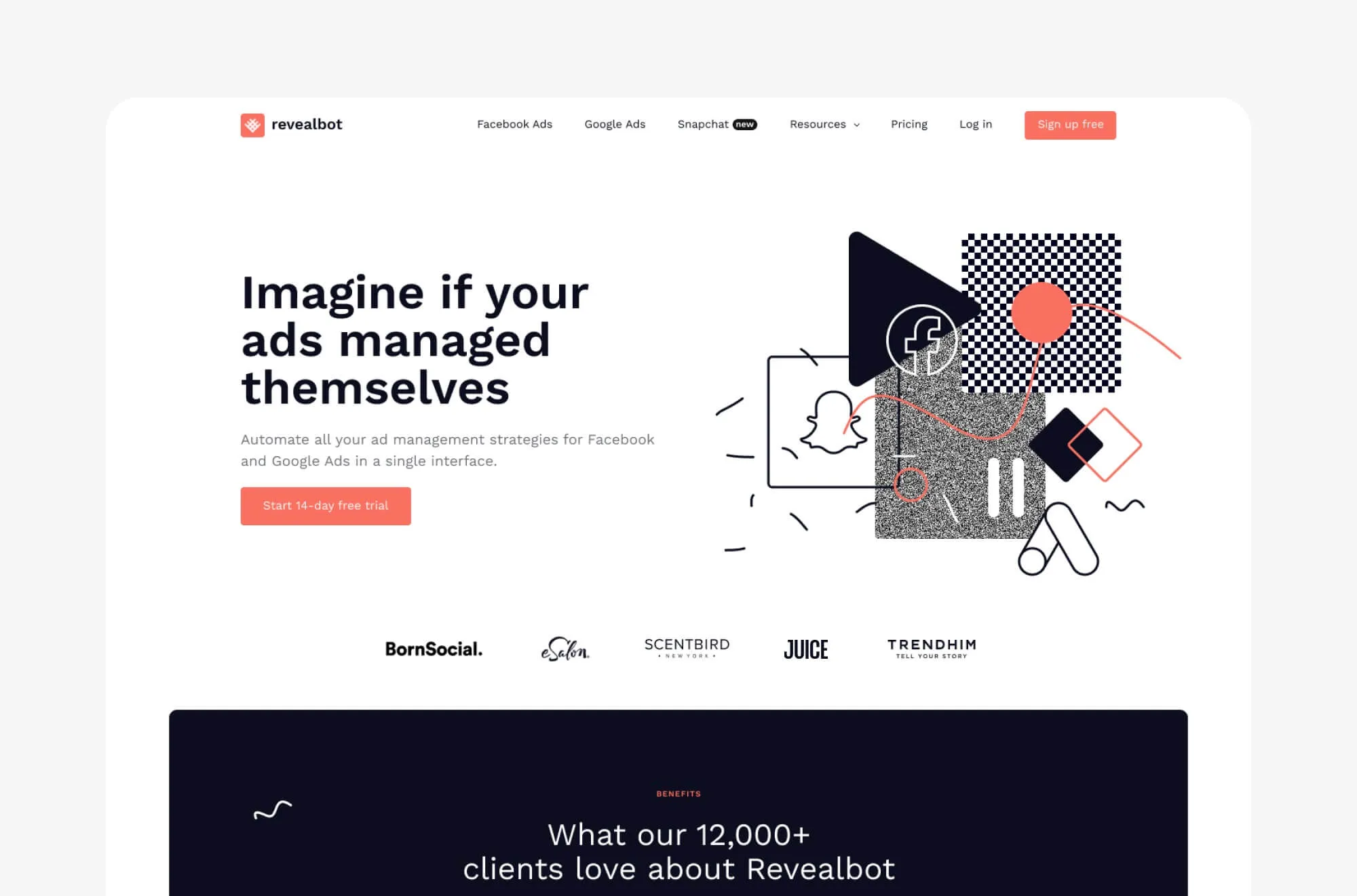
But as time passed we realized that the old style just wasn’t cutting it for us anymore. It was grunge, with hand-drawn illustrations, wavy lines, and abstract shapes. Certainly friendly and cool-looking. But also restrictive when it comes to explaining how the product works.
We realized that ads automation is a complex and moving process. So we wanted to create a style that would allow us to focus on the dynamic nature of automation while illustrating what it’s like to use the product. We wanted users to imagine interacting with Bïrch even before they create an account.
What’s more, advertisers trust Bïrch with their account management — and by extension — with the management of their marketing budgets. In fact, collectively, we help clients manage over $200 million in yearly ads budget. It was crucial that Bïrch feels like a platform one can entrust with their marketing management.
So, new style goals are:
- Communicate trust
- Explain the automation process
- Illustrate value
Introducing the new Bïrch style
So, how did we achieve our goals? In a few words, we embraced modern minimalism. These are the main elements of the new Bïrch style:
Simple shapes. Intricate organic shapes and hand-drawn illustrations give way to clear-cut geometry and UI elements. Focus on simplicity helps to create a clear visual hierarchy of information and highlights the next big change: illustration style.
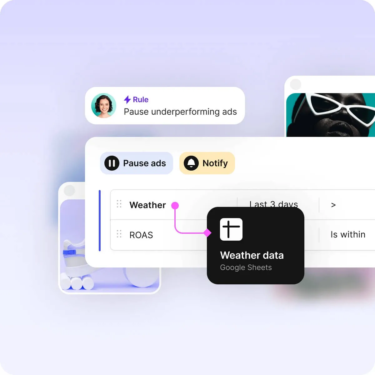
Interface front-and-center. New illustrations feature stylized Bïrch interface elements and ad miniatures. The process and the result. Shadows and realistic materials — like transparent glass — give illustrations a tangible quality.

The new brand color: blue. Coral is replaced by blue as the main brand color. Coral is a color of love, courage, but also danger. Bïrch is not dangerous. Actually, it’s very safe. We promise. Which is why we chose blue: the color of calmness and security.

What to expect next?
We are only getting started with the restyling. Most of the work is still ahead. The last website release laid the foundation for the next stage: animating the interface.
We will replace our current static imagery with interface animations that will illustrate the process of automation more clearly.
We will also focus on communicating value. We plan to feature numbers and facts to explain the advantages of using Bïrch while populating the website with more useful information.
You can also expect to see similar restyling taking place in the blog.
Have feedback for the Bïrch design team? Drop a line to Bïrch’s lead designer, Andrey, at andrey@bir.ch
FAQs
What happened to Revealbot?
Revealbot underwent a comprehensive rebrand and is now known as Bïrch. This transformation reflects our renewed focus on blending automation efficiency with creative collaboration.
The Bïrch (formerly Revealbot) website got a new look. In this article, we’re taking a dive into the reasoning behind the restyling, the elements of the new visuals, and what to expect next.
For us at Bïrch, design has always been a crucial element of our product. We aimed to create a friendly and accommodating look. But as the company and Bïrch community grew, our priorities and vision began to evolve. It was time to make some changes.
Why did we decide to restyle?
We really like the old Bïrch look. In fact, we will be remembering it with a lot of nostalgia.

But as time passed we realized that the old style just wasn’t cutting it for us anymore. It was grunge, with hand-drawn illustrations, wavy lines, and abstract shapes. Certainly friendly and cool-looking. But also restrictive when it comes to explaining how the product works.
We realized that ads automation is a complex and moving process. So we wanted to create a style that would allow us to focus on the dynamic nature of automation while illustrating what it’s like to use the product. We wanted users to imagine interacting with Bïrch even before they create an account.
What’s more, advertisers trust Bïrch with their account management — and by extension — with the management of their marketing budgets. In fact, collectively, we help clients manage over $200 million in yearly ads budget. It was crucial that Bïrch feels like a platform one can entrust with their marketing management.
So, new style goals are:
- Communicate trust
- Explain the automation process
- Illustrate value
Introducing the new Bïrch style
So, how did we achieve our goals? In a few words, we embraced modern minimalism. These are the main elements of the new Bïrch style:
Simple shapes. Intricate organic shapes and hand-drawn illustrations give way to clear-cut geometry and UI elements. Focus on simplicity helps to create a clear visual hierarchy of information and highlights the next big change: illustration style.

Interface front-and-center. New illustrations feature stylized Bïrch interface elements and ad miniatures. The process and the result. Shadows and realistic materials — like transparent glass — give illustrations a tangible quality.

The new brand color: blue. Coral is replaced by blue as the main brand color. Coral is a color of love, courage, but also danger. Bïrch is not dangerous. Actually, it’s very safe. We promise. Which is why we chose blue: the color of calmness and security.

What to expect next?
We are only getting started with the restyling. Most of the work is still ahead. The last website release laid the foundation for the next stage: animating the interface.
We will replace our current static imagery with interface animations that will illustrate the process of automation more clearly.
We will also focus on communicating value. We plan to feature numbers and facts to explain the advantages of using Bïrch while populating the website with more useful information.
You can also expect to see similar restyling taking place in the blog.
Have feedback for the Bïrch design team? Drop a line to Bïrch’s lead designer, Andrey, at andrey@bir.ch
FAQs
What happened to Revealbot?
Revealbot underwent a comprehensive rebrand and is now known as Bïrch. This transformation reflects our renewed focus on blending automation efficiency with creative collaboration.


