Hey! I’m Eugene, a Product Designer at Bïrch, and this is the story of my first big project here. During my interview, I pitched a detailed plan to improve the company signup process instead of just talking about past work. I used a comprehensive Customer Journey Map and showed how to improve things.
Little did I know that this proactive approach would become the catalyst for a radical sign-up redesign, cutting user registration time 3x and boosting the conversion rate for registrations.
Getting to Know Target Audience: Emily’s Story

To really get what Bïrch users go through, I created a persona that shows modern marketers’ true, raw reality. Emily isn’t just a profile—she’s a dynamic professional with a mission:
- Time is her most precious resource: constantly juggling multiple tasks and tight deadlines;
- Data detective: wrestling with complex marketing analytics to make smart advertising decisions;
- Solution seeker: always hunting for tools that can streamline her workflow;
- Quick Starter: wants to explore and implement new technologies without getting bogged down.
By seeing the sign-up process through Emily’s eyes, I mapped her entire sign-up journey, revealing critical pain points and uncovering key opportunities for improvement. This approach made my design more human and empathetic, ensuring I addressed real user needs.
The Customer Journey Map: Where Things Went South
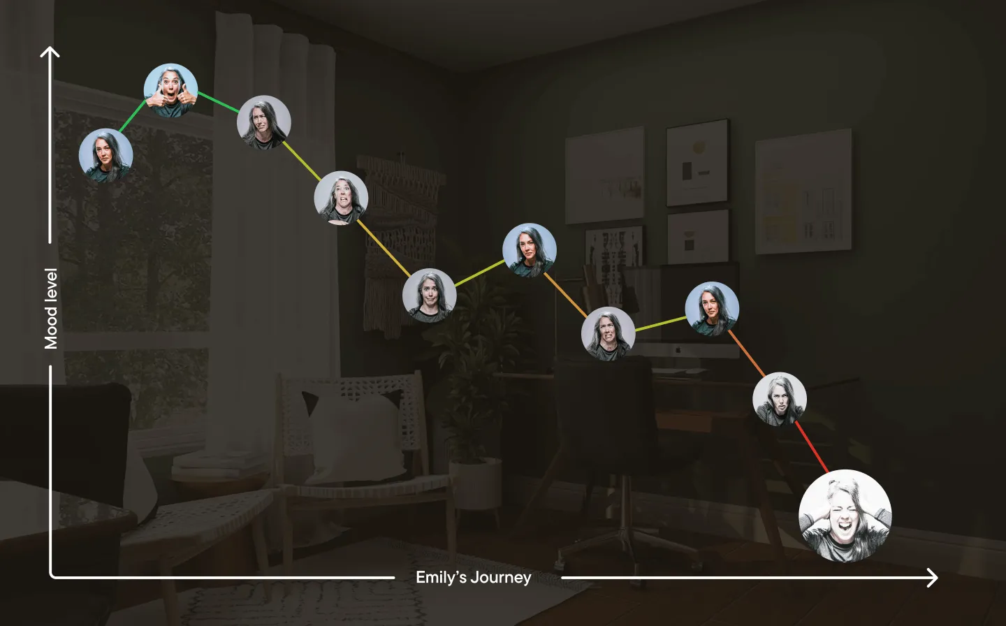
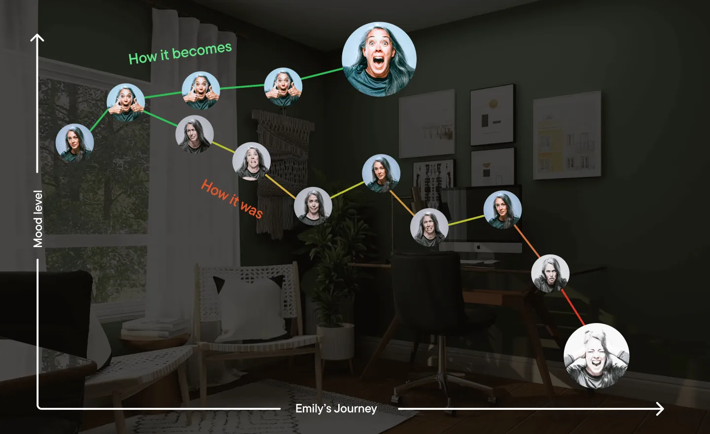
Inspired by Growth.Design’s approach: I crafted a Customer Journey Map (CJM) that showed Emily’s emotional rollercoaster through our sign-up process. Spoiler: it wasn’t a fun ride.
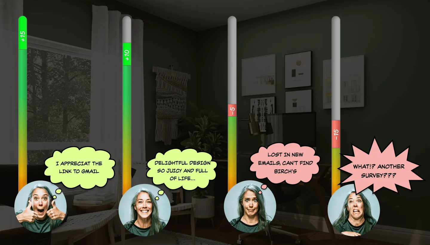
In this case, I showed Emily’s mood bar and illustrated how it shifts throughout the signup process, highlighting not only problem areas but also positive aspects.

I described every problem point with data insights and UX statements.
📊 According to a statistic: on PR Newswire, 67% of people who abandon lengthy online forms never return. So, it’s crucial to request only the essential information.
The Major Roadblocks
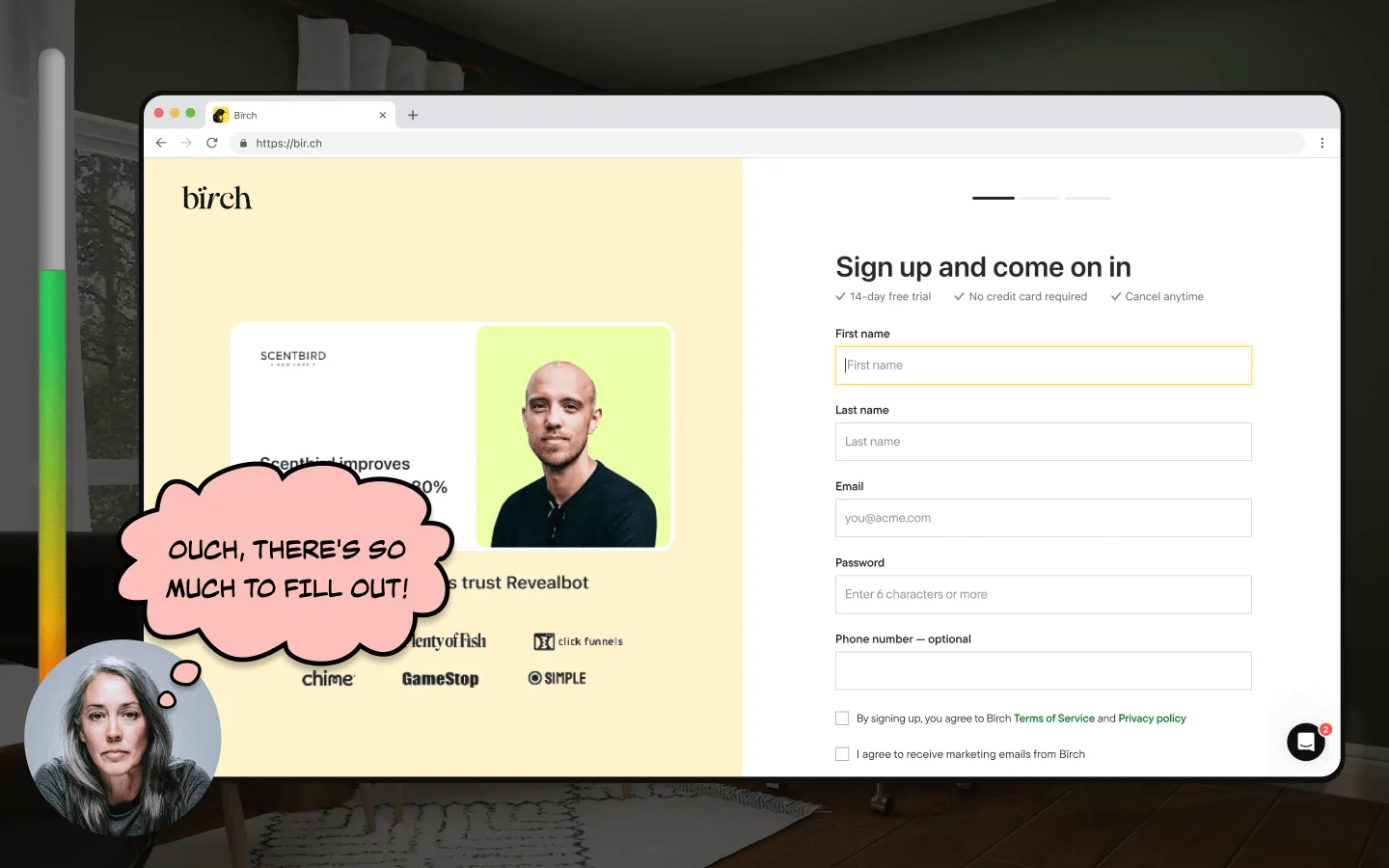
1. Data Overload
The company collected more information than a nosy neighbour would:
- Steps that can be skipped or simplified;
- Unnecessary data collection with no practical use;
- Excessive dropdown options create decision fatigue.
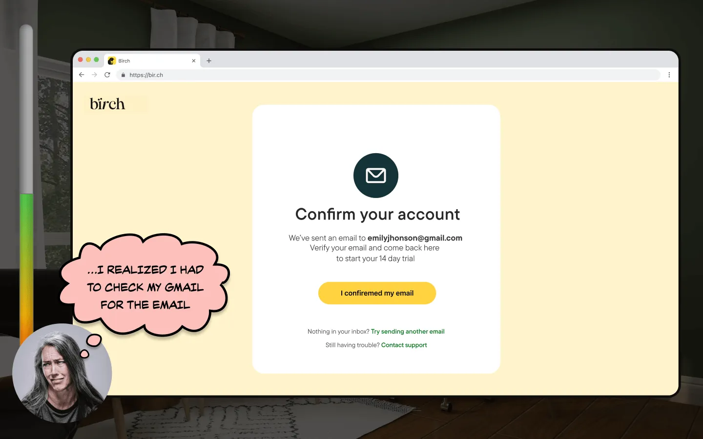
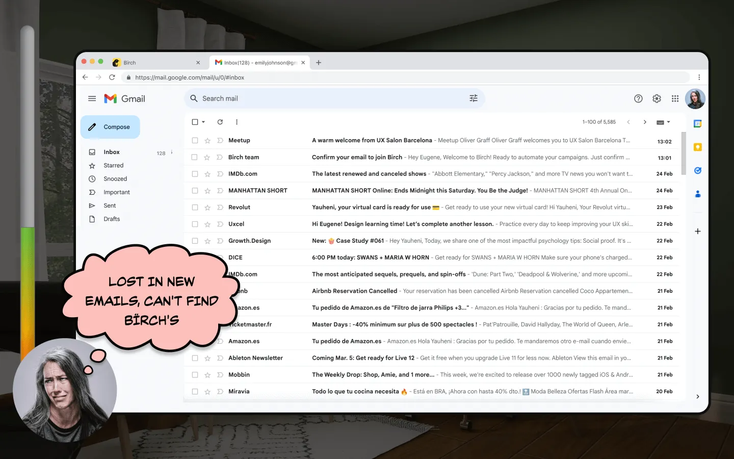
2. Email Confirmation Maze
The confirmation process felt like a frustrating game of “Find the Hidden Email”:
- At the start of the confirmation process, we didn’t provide any assistance in locating the confirmation email;
- After users confirmed their email, the sign-up process unexpectedly ended, leaving them to figure out how to return.
3. Popup Palooza
Bïrch bombarded users with more popups than a whack-a-mole game.
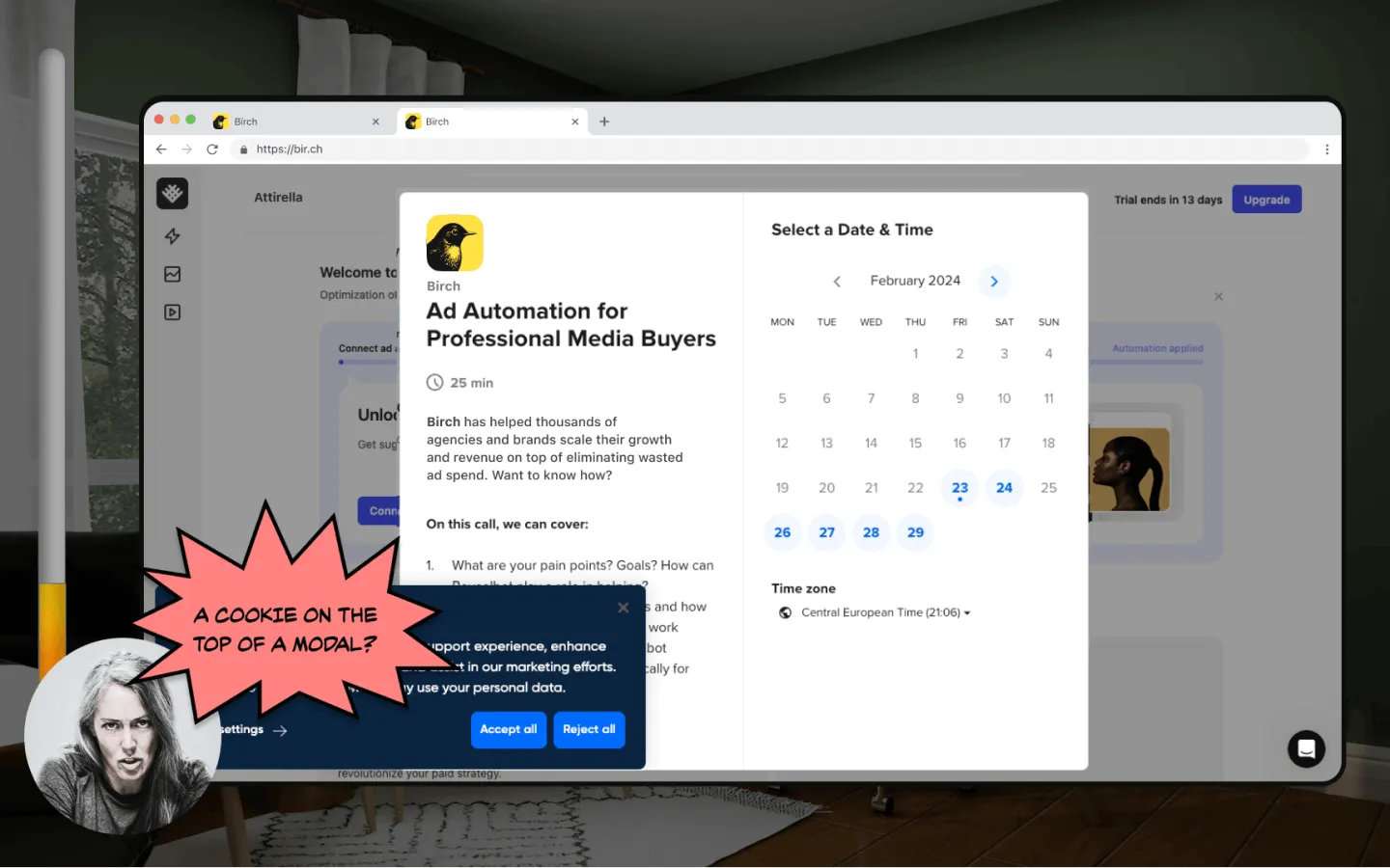
Ka-boom
The result? Emily (and probably many real users) gave up before even starting.

I presented the entire Customer Journey Map (CJM), showing how Emily navigated the registration process.
The New Flow: Streamlining the Sign-Up Experience
Here’s how I proposed transforming the sign-up process from a marathon into a sprint.
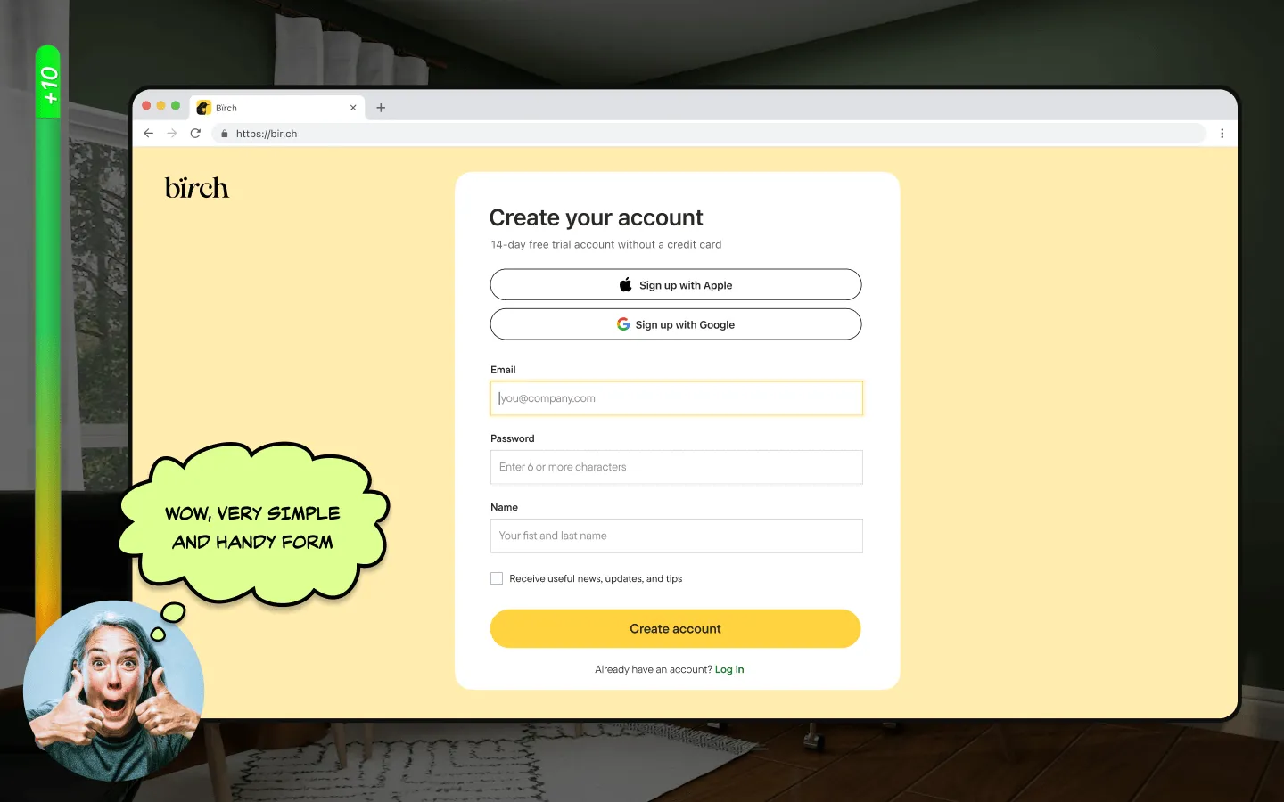
1. Social Login
I suggested fast sign-up via Google and Facebook.
📊 Formstack reported that their conversion rates triple with social media autofill!
2. Email Provider Detection
I prefer email detectives who offer direct links to email services, which makes the process faster and easier without disruptions.
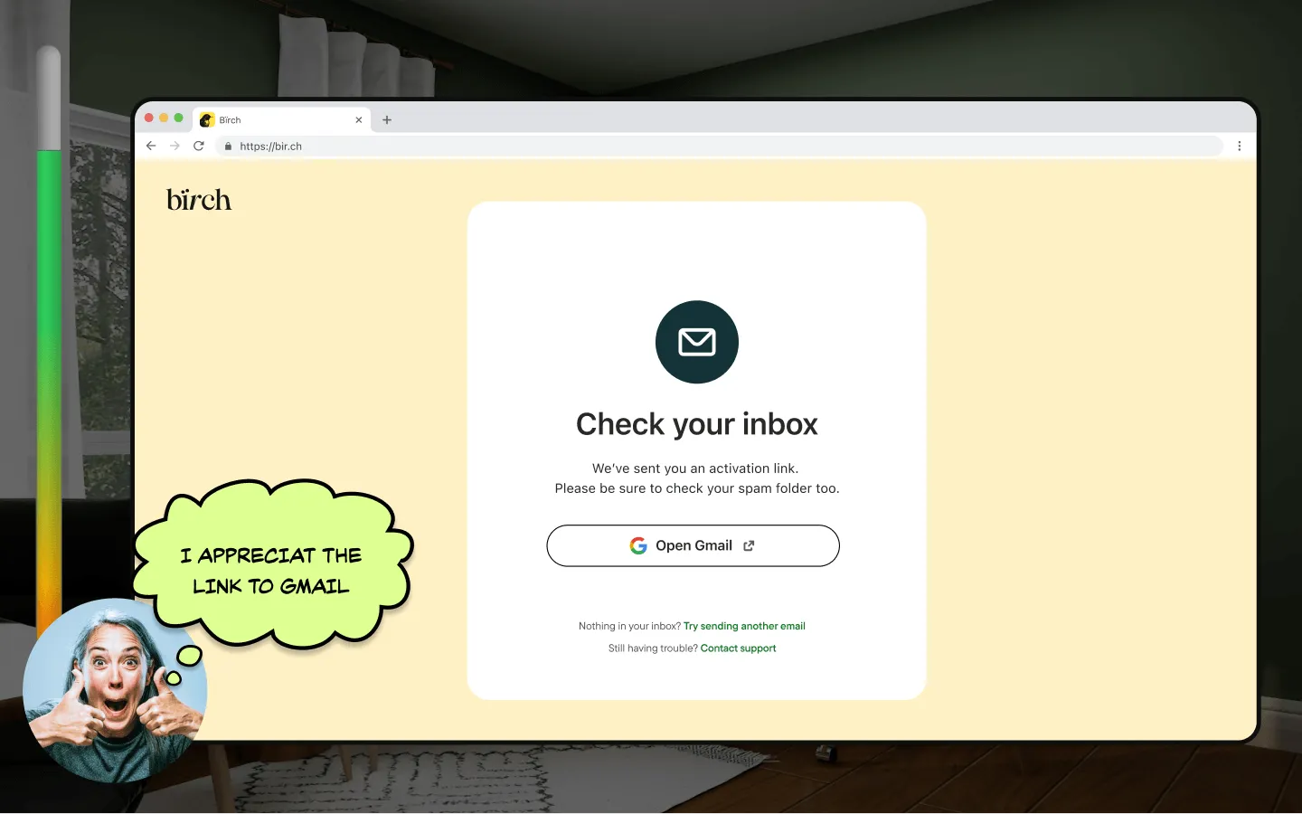
Here's how it works for Gmail, Outlook, Yahoo, Proton and iCloud.

3. Sniper Links
Sniper Links help display emails from the required domain by adding necessary parameters to the URL.
📊 Sniper Links helped Growth.Design boosted their confirmation rates by 7%.
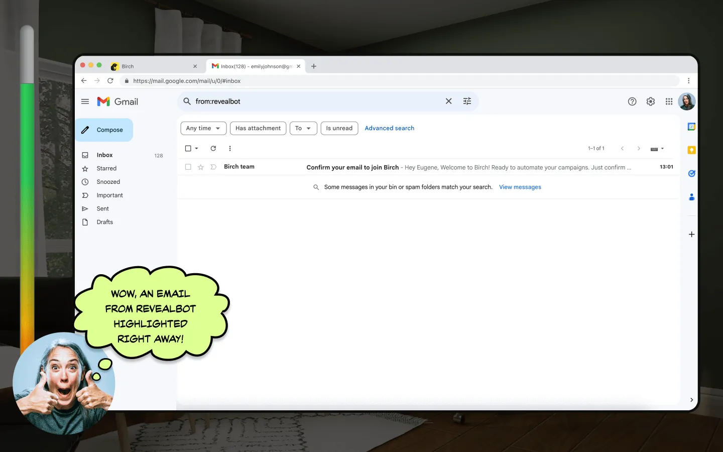
It also works for Gmail, Outlook, Yahoo, Proton and iCloud.

Streamlined Registration Process
I suggested reducing unnecessary steps to make the process as short and seamless as possible. After the initial registration and the “aha” moment, users would then be prompted to provide any additional information.
From Concept to Real Implementation
My proposal resonated with the team and received enthusiastic support.
Fortunately, the team was already addressing the sign-up redesign, making my proposal timely. The alignment between my ideas and the company’s priorities led to an exciting development: these concepts became the foundation for my onboarding project, allowing me to implement them in production.
Adapting the Concept to Reality
Like any project, the journey from the initial concept to the final product required some adjustments.
Here are the key changes we made during implementation:
- Facebook Auth: We opted for quick login through Google only, as many of our agency users manage multiple Facebook accounts for clients;
- Balancing Brevity and Information: We streamlined the process but couldn’t make it as short as initially planned. Some essential information, such as Client Name and Company Industry, remained necessary during signup;
- Mobile Version: With over 60% of users registering on mobile devices, we developed a responsive signup process that adjusts seamlessly to different screen sizes, enhancing user experience.

Measuring Impact
By stepping into Emily’s shoes, we improved not just a form but our entire user onboarding experience:
- Users now complete registration three times faster, enhancing their initial interaction with our product;
- While we anticipate this speed boost will positively affect conversion rates, we lack precise data to confirm this;
- We will introduce more personalized onboarding experiences tailored to user roles and goals.

We missed the chance to gather concrete metrics through A/B testing, which involves comparing two web page versions or features to determine which performs better.
Moving forward, I'll prioritize implementing strong tracking methods to better measure the impact of our UX improvements.
From Job Interview to Real Change
This journey started with a proactive pitch during my interview, and it’s turned out to be more than just fixing a form—it’s been a valuable learning experience and a win for both me and the company.
While we’ve made significant progress, we’re excited about the potential for even more improvements. Our next steps include diving deeper into data analysis and creating more personalized experiences.
By consistently putting ourselves in our users' shoes, we're crafting experiences that really resonate. Here's to smoother sign-ups, happier users, and innovative solutions ahead!
Wrapped up by the song of David Bowie — Space Oddity


.jpg)
