Do you know every Facebook ad size for every ad type by heart? Well, neither do we. Which is why we made this one-stop guide for Facebook ads image sizes.
Facebook is well known for regularly updating image size requirements and introducing new ad formats. Unfortunately, they’re also known for giving slightly conflicting and ambiguous recommendations. At least in some cases.
This makes the life of marketers a little difficult. After all, Facebook obligates ads to meet specifications all the way to ensure optimal delivery.
And meet them all the way you should. Out of more than 7 million active advertisers, many will get it right. There is nothing worse than missing valuable impressions because you uploaded a 1.90:1 image instead of 1.91:1.
To help you avoid that problem, we’ve gathered the most commonly used Facebook ad types in one list along with their respective up-to-date requirements.
Without further ado, here’s our comprehensive guide to Facebook ads image sizes.
Tip: use the table of contents on your left to jump to a specific ad format. Or keep on reading for useful general advice.
Facebook's recommendations
Although Facebook has canceled text-to-image ratio restrictions, the platform still indicates that text should take no more than 20% of a creative’s area.
Facebook advises keeping creatives simple and to the point. If the message seems too complex to fit in one image, you can use ad types like carousels, that allow displaying multiple images in succession. Or, you know, a video.
Last but not least, use the ad preview tool to check how your combination of text and imagery will look across Facebook’s delivery touchpoints.
Minimum width vs. recommended resolution
These two recommendations usually differ. And it’s a bit confusing. The former is the minimum size required for the ad to load without throwing an error. However, the resulting quality will be on the low side. We recommend paying attention to the latter and following the recommended resolution guidelines.
What do Revealbot designers do?
We usually take the recommended resolution and multiply it by two. So, if the recommended resolution is 1080 pixels on the long side, we create an image that is 2160 pixels on the long side.
This has proven to create fast-loading, high-quality imagery which — from the technical standpoint — always works a treat.
Should you upload 30 MB images?
The short answer is: no, you shouldn’t.
Facebook takes images up to 30 MB in size. But when it comes to image weight, less is always better.
The social network has a proprietary compression algorithm that automatically applies to creatives you upload. Unfortunately, it’s a bit iffy.
Some users report that uploading light files reduces compression artifacts. Also, respecting pixel dimensions is especially important here.
To get small file sizes without compromising quality:
- Use an online compression tool, such as Optimizilla
- Or compress images manually in software like Photoshop
What is small, then? Aim for less than 1 MB.
JPG or PNG?
We’re definitely team PNG here at Revealbot. PNG compresses much smaller without introducing visible banding into gradients. It preserves quality and makes your images load faster. Nowadays, there’s little incentive to use JPG.
Now getting back to image size requirements. We sorted them by placement to help you find what you need.
Facebook Feed
As we all know, the feed is the first thing users see when they log into the platform. Ads displayed there look similar to organic posts. This was probably originally designed to battle banner blindness. Nowadays it arguably contributes to it.
Still, the feed is a staple placement thanks to its sheer visibility: approximately 1.93 billion users visit it every day, and ads displayed there are prominent on users’ screens.
Also, social engagement has a chance to improve ad effectiveness. So, all hail the like-generation sites.
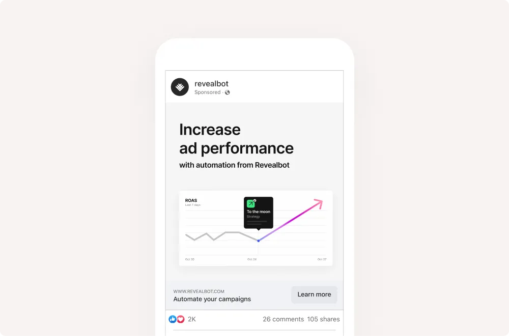
Feed single image
- Ratio: 1.91:1 to 1:1
- Minimum width: 600 pixels
- Minimum height: 600 pixels
- Resolution: 1080 x 1080 pixels pixels or higher
- Format: JPG or PNG
Feed carousel
- Ratio: 1:1
- Minimum width: 600 pixels
- Minimum height: 600 pixels
- Resolution: 1080 x 1080 pixels or higher
- Format: JPG or PNG

News feed collection
- Ratio: 1:1
- Resolution: At least 1080 x 1080 pixels Format: JPG or PNG
Facebook Right column
Ads displayed in the right column generally have lower CPM costs. But this is counterbalanced by lower forecasted CTR across the board.
These ads are available only on the Desktop. Objectives are limited to Traffic, Conversions, and Catalogue sales.

Facebook also ambiguously remarks that while “these ads most commonly appear in the right-hand column of Facebook Pages” sometimes they “appear in other” places.
Right column single image
- Ratio: 1:1
- Minimum width: 254 pixels
- Minimum height: 133 pixels
- Resolution: 1080 x 1080 pixels pixels or higher
- Format: JPG or PNG
By the way, are you also confused why the minimum width and height requirements are different but the recommended ratio is 1:1? Because we sure are.
Right column carousels
You can upload from 2 to 10 images.
- Ratio: 1:1
- Resolution: 1080 x 1080 pixels or higher
- Format: JPG or PNG
Facebook Instant articles
Instant articles are articles that are optimized for quick loading on mobile devices.
After Facebook introduced this content format the popularity of instant articles surged among prominent publishers: this type of content showed higher engagement across the board.
However, the format was later picked up by spammers causing some big players to abandon it. This created some controversy. Regardless, it’s still a promising format worth trying out.
Instant articles single image
- Ratio: 1.91:1 to 1:1
- Resolution: 1080 x 1080 pixels or higher
- Format: JPG or PNG
Instant article carousels
These can take from 2 to 10 images.
- Ratio: 1:1
- Minimum width: 500 pixels
- Resolution: At least 1080 x 1080 pixels or higher
- Format: JPG or PNG
Facebook In-stream video
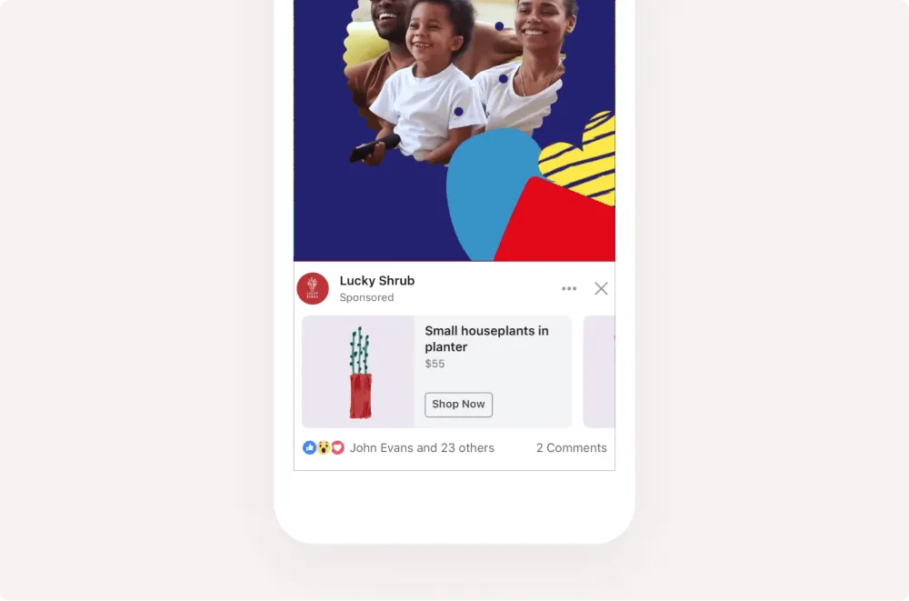
In-stream image ads display your offer by delivering an image mid-stream or mid-video. Like the annoying YouTube ads that interrupt your favorite videos. They appear in the content of approved creators across gaming, entertainment, and sports industries, among others.
In-stream video single image
- Ratio: 1.91:1 to 1:1
- Minimum width: 254 pixels
- Minimum height: 133 pixels
- Resolution: 1080 x 1080 pixels or higher
- Format: JPG or PNG
In-stream video collection
- Image ratio: 1.91:1 to 1:1
- Resolution: 1080 x 1080 pixels pixels or higher
- Format: JPG or PNG
Facebook Marketplace
Facebook marketplace reportedly registered over a billion active users in the first quarter of 2021. It’s the perfect placement for finding users who are ready to make a purchase.

Marketplace single image
- Ratio: 1:1
- Resolution: At least 1080 x 1080 pixels
- Format: JPG or PNG
Marketplace carousel
- Ratio: 1:1
- Resolution: At least 1080 x 1080 pixels
- Format: JPG or PNG
Facebook Stories
These ads interrupt organic stories and linger as full-screen images for 5 seconds or until the user swipes out of them. This ad type is highly effective, some advertisers reporting up to 44% higher reach compared to other formats.
Stories single image
- Ratio: 9:16
- Minimum width: 500 pixels
- Resolution: At least 1080 x 1080 pixels
- Format: JPG or PNG
Stories carousels
These can take up to 3 images.
- Ratio: 1:1
- Resolution: At least 1080 x 1080 pixels
- Format: JPG or PNG
Facebook recommends making sure that the top and bottom 14% of the image (or 250px) are free from text. This way navigational UI elements remain unobstructed.
Facebook search results
Search results provide the opportunity to target users who are actively looking for an offer like yours. A great placement if you’re after conversions.

Search results image
- Ratio: 1:1
- Minimum width: 500 pixels
- Resolution: At least 1080 x 1080
- Format: JPG or PNG
Sponsored messages
Sponsored messages appear in Messenger conversations that users initiated with your business. They can only be displayed to users who have already reached out to you. The only supported format here is single image.
- Ratio: 1.91:1
- Resolution: At least 1080 x 1080 pixels
- Format: JPG or PNG
Messenger inbox
Messenger inbox ads appear between conversations in messenger. Clicking on an ad opens up an extended preview.
Messenger inbox single image
- Ratio: 1:1
- Minimum width: 500 pixels
- Resolution: At least 1080 x 1080
- Format: JPG or PNG
Messenger inbox carousel
- Ratio: 1:1
- Resolution: At least 1080 x 1080 pixels
- Format: JPG or PNG
More ad formats
Panorama is like a Carousel, but all images are stitched together in a virtual circular canvas users can scroll by dragging their mouse. The resulting 360 degree images are great at creating immersion but are rather specialized.

Audience Network Native, Banner, and Interstitial allows displaying your ads on the website of Facebook publishers. This format takes images with a 9:16 ratio, uploaded in JPG or PNG. The minimum sizes are 398 pixels width to 208 pixels height. The same 30 MB weight limit applies.

Do you know every Facebook ad size for every ad type by heart? Well, neither do we. Which is why we made this one-stop guide for Facebook ads image sizes.
Facebook is well known for regularly updating image size requirements and introducing new ad formats. Unfortunately, they’re also known for giving slightly conflicting and ambiguous recommendations. At least in some cases.
This makes the life of marketers a little difficult. After all, Facebook obligates ads to meet specifications all the way to ensure optimal delivery.
And meet them all the way you should. Out of more than 7 million active advertisers, many will get it right. There is nothing worse than missing valuable impressions because you uploaded a 1.90:1 image instead of 1.91:1.
To help you avoid that problem, we’ve gathered the most commonly used Facebook ad types in one list along with their respective up-to-date requirements.
Without further ado, here’s our comprehensive guide to Facebook ads image sizes.
Tip: use the table of contents on your left to jump to a specific ad format. Or keep on reading for useful general advice.
Facebook's recommendations
Although Facebook has canceled text-to-image ratio restrictions, the platform still indicates that text should take no more than 20% of a creative’s area.
Facebook advises keeping creatives simple and to the point. If the message seems too complex to fit in one image, you can use ad types like carousels, that allow displaying multiple images in succession. Or, you know, a video.
Last but not least, use the ad preview tool to check how your combination of text and imagery will look across Facebook’s delivery touchpoints.
Minimum width vs. recommended resolution
These two recommendations usually differ. And it’s a bit confusing. The former is the minimum size required for the ad to load without throwing an error. However, the resulting quality will be on the low side. We recommend paying attention to the latter and following the recommended resolution guidelines.
What do Revealbot designers do?
We usually take the recommended resolution and multiply it by two. So, if the recommended resolution is 1080 pixels on the long side, we create an image that is 2160 pixels on the long side.
This has proven to create fast-loading, high-quality imagery which — from the technical standpoint — always works a treat.
Should you upload 30 MB images?
The short answer is: no, you shouldn’t.
Facebook takes images up to 30 MB in size. But when it comes to image weight, less is always better.
The social network has a proprietary compression algorithm that automatically applies to creatives you upload. Unfortunately, it’s a bit iffy.
Some users report that uploading light files reduces compression artifacts. Also, respecting pixel dimensions is especially important here.
To get small file sizes without compromising quality:
- Use an online compression tool, such as Optimizilla
- Or compress images manually in software like Photoshop
What is small, then? Aim for less than 1 MB.
JPG or PNG?
We’re definitely team PNG here at Revealbot. PNG compresses much smaller without introducing visible banding into gradients. It preserves quality and makes your images load faster. Nowadays, there’s little incentive to use JPG.
Now getting back to image size requirements. We sorted them by placement to help you find what you need.
Facebook Feed
As we all know, the feed is the first thing users see when they log into the platform. Ads displayed there look similar to organic posts. This was probably originally designed to battle banner blindness. Nowadays it arguably contributes to it.
Still, the feed is a staple placement thanks to its sheer visibility: approximately 1.93 billion users visit it every day, and ads displayed there are prominent on users’ screens.
Also, social engagement has a chance to improve ad effectiveness. So, all hail the like-generation sites.

Feed single image
- Ratio: 1.91:1 to 1:1
- Minimum width: 600 pixels
- Minimum height: 600 pixels
- Resolution: 1080 x 1080 pixels pixels or higher
- Format: JPG or PNG
Feed carousel
- Ratio: 1:1
- Minimum width: 600 pixels
- Minimum height: 600 pixels
- Resolution: 1080 x 1080 pixels or higher
- Format: JPG or PNG

News feed collection
- Ratio: 1:1
- Resolution: At least 1080 x 1080 pixels Format: JPG or PNG
Facebook Right column
Ads displayed in the right column generally have lower CPM costs. But this is counterbalanced by lower forecasted CTR across the board.
These ads are available only on the Desktop. Objectives are limited to Traffic, Conversions, and Catalogue sales.

Facebook also ambiguously remarks that while “these ads most commonly appear in the right-hand column of Facebook Pages” sometimes they “appear in other” places.
Right column single image
- Ratio: 1:1
- Minimum width: 254 pixels
- Minimum height: 133 pixels
- Resolution: 1080 x 1080 pixels pixels or higher
- Format: JPG or PNG
By the way, are you also confused why the minimum width and height requirements are different but the recommended ratio is 1:1? Because we sure are.
Right column carousels
You can upload from 2 to 10 images.
- Ratio: 1:1
- Resolution: 1080 x 1080 pixels or higher
- Format: JPG or PNG
Facebook Instant articles
Instant articles are articles that are optimized for quick loading on mobile devices.
After Facebook introduced this content format the popularity of instant articles surged among prominent publishers: this type of content showed higher engagement across the board.
However, the format was later picked up by spammers causing some big players to abandon it. This created some controversy. Regardless, it’s still a promising format worth trying out.
Instant articles single image
- Ratio: 1.91:1 to 1:1
- Resolution: 1080 x 1080 pixels or higher
- Format: JPG or PNG
Instant article carousels
These can take from 2 to 10 images.
- Ratio: 1:1
- Minimum width: 500 pixels
- Resolution: At least 1080 x 1080 pixels or higher
- Format: JPG or PNG
Facebook In-stream video
In-stream image ads display your offer by delivering an image mid-stream or mid-video. Like the annoying YouTube ads that interrupt your favorite videos. They appear in the content of approved creators across gaming, entertainment, and sports industries, among others.

In-stream video single image
- Ratio: 1.91:1 to 1:1
- Minimum width: 254 pixels
- Minimum height: 133 pixels
- Resolution: 1080 x 1080 pixels or higher
- Format: JPG or PNG
In-stream video collection
- Image ratio: 1.91:1 to 1:1
- Resolution: 1080 x 1080 pixels pixels or higher
- Format: JPG or PNG
Facebook Marketplace
Facebook marketplace reportedly registered over a billion active users in the first quarter of 2021. It’s the perfect placement for finding users who are ready to make a purchase.

Marketplace single image
- Ratio: 1:1
- Resolution: At least 1080 x 1080 pixels
- Format: JPG or PNG
Marketplace carousel
- Ratio: 1:1
- Resolution: At least 1080 x 1080 pixels
- Format: JPG or PNG
Facebook Stories
These ads interrupt organic stories and linger as full-screen images for 5 seconds or until the user swipes out of them. This ad type is highly effective, some advertisers reporting up to 44% higher reach compared to other formats.
Stories single image
- Ratio: 9:16
- Minimum width: 500 pixels
- Resolution: At least 1080 x 1080 pixels
- Format: JPG or PNG
Stories carousels
These can take up to 3 images.
- Ratio: 1:1
- Resolution: At least 1080 x 1080 pixels
- Format: JPG or PNG
Facebook recommends making sure that the top and bottom 14% of the image (or 250px) are free from text. This way navigational UI elements remain unobstructed.
Facebook search results
Search results provide the opportunity to target users who are actively looking for an offer like yours. A great placement if you’re after conversions.

Search results image
- Ratio: 1:1
- Minimum width: 500 pixels
- Resolution: At least 1080 x 1080
- Format: JPG or PNG
Sponsored messages
Sponsored messages appear in Messenger conversations that users initiated with your business. They can only be displayed to users who have already reached out to you. The only supported format here is single image.
- Ratio: 1.91:1
- Resolution: At least 1080 x 1080 pixels
- Format: JPG or PNG
Messenger inbox
Messenger inbox ads appear between conversations in messenger. Clicking on an ad opens up an extended preview.
Messenger inbox single image
- Ratio: 1:1
- Minimum width: 500 pixels
- Resolution: At least 1080 x 1080
- Format: JPG or PNG
Messenger inbox carousel
- Ratio: 1:1
- Resolution: At least 1080 x 1080 pixels
- Format: JPG or PNG
More ad formats
Panorama is like a Carousel, but all images are stitched together in a virtual circular canvas users can scroll by dragging their mouse. The resulting 360 degree images are great at creating immersion but are rather specialized.

Audience Network Native, Banner, and Interstitial allows displaying your ads on the website of Facebook publishers. This format takes images with a 9:16 ratio, uploaded in JPG or PNG. The minimum sizes are 398 pixels width to 208 pixels height. The same 30 MB weight limit applies.


